
Maap

App design for MAAP. Enabling customers to shop for products.
With a passion for innovation and a commitment to providing the best experience for its customers, cycling apparel brand, Maap, are rapidly releasing new product every season without currently utilising an app.
So, I decided to put together an initial design that would help their customers purchase their products on mobile devices through an app.

Create a simple and smooth user experience that streamlines the purchasing process for Maap’s customers.
01 Objective
02 Challenge
Define a simple design system that leads the user through the app with ease. Whilst keeping in line with the brand identity.
03 Opportunity
Build a solution that highlights the most popular features and products, whilst creating an engaging user experience.
font styles
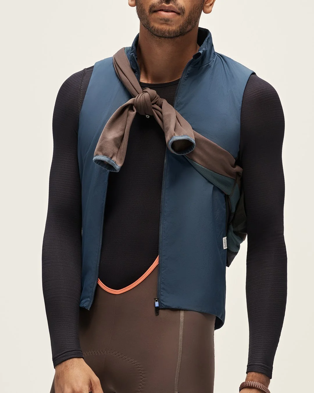
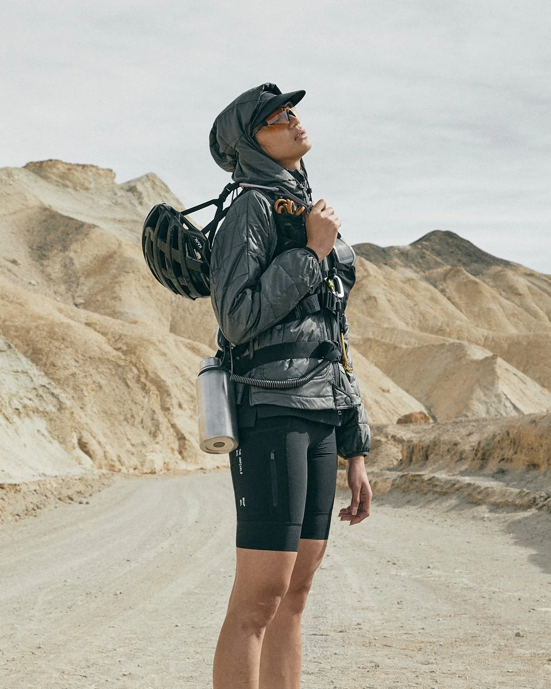
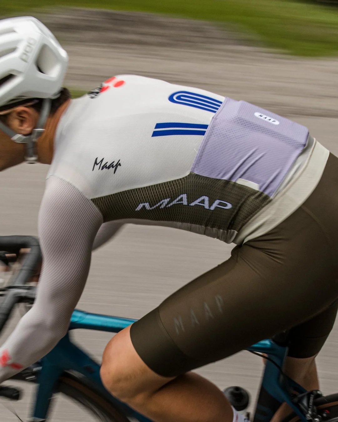
Before diving into any design work, the project started with thinking about what defines Maap as a brand. Looking into the colours, materials, textures, fonts, photography and creative direction. With the app design in mind, the main focus was on brand identity.
Research + Moodboard

apparel & product


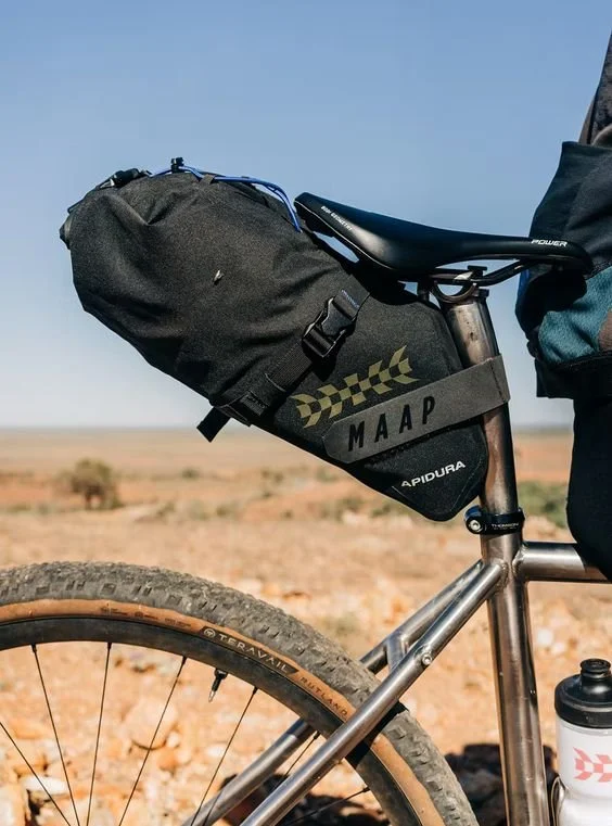
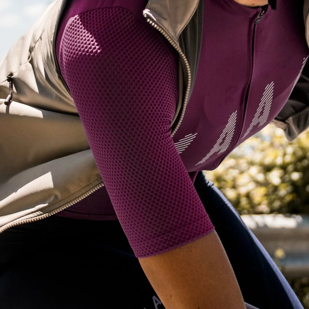
texture
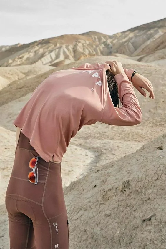

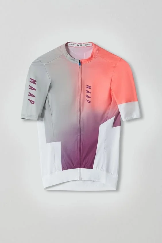

colours

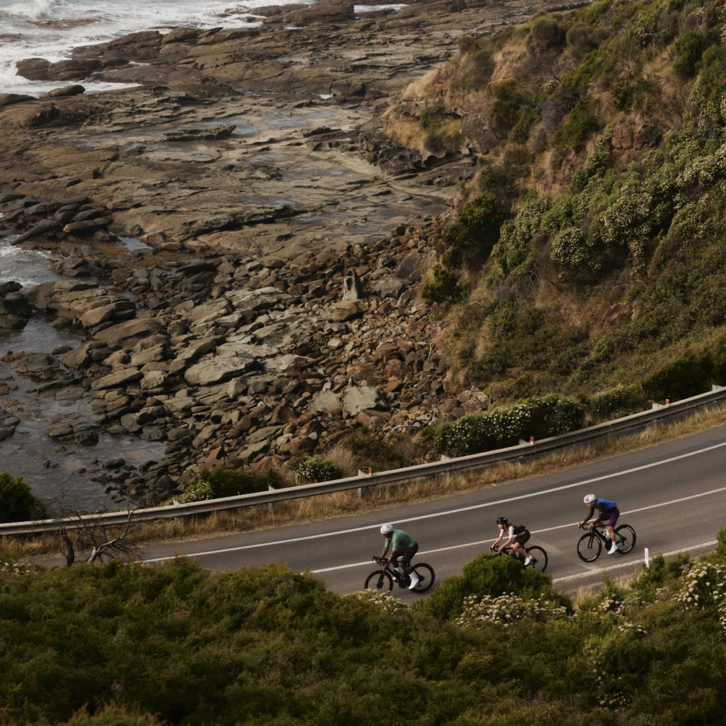
context & surroundings
Low Fidelity Wireframes + Social Campaigns
After research and mood boarding, the next steps involved creating low fidelity wireframes to help plan out how the app would function and which screens were needed. Experimenting with ideas for screens and user journeys helped define and simplify the app design.

Finally, after developing the wireframes, it was time to put together some mock ups ideas in Figma. The mock ups include carefully selected colour combinations, imagery and product information, all in line with maap’s brand identity and creative vision.
Mock Ups


