
WatchHouse x Nike

An iconic collaboration. WatchHouse x NIKE unite runners and coffee enthusiasts.
This project is all about merging a global, iconic brand with a modern UK based brand.
The redesign of the WatchHouse app includes an exclusive collaboration area where WatchHouse have teamed up with NIKE’s House of Innovation. The campaign focuses on imagery that highlights the identity of each brand and brings them together. The main aim from the collaboration was to celebrate each brand and show how they coincide.


01 Objective
Create a product that enhances and elevates the user experience and interaction for both brands, whilst maintaining brand identity.
Merge the two brands to bring customers from both brands together, whilst creating an awareness for each brand individually.
02 Challenge
03 Opportunity
Increase the customer base for both brands, creating an overlap between them whilst promoting them individually.

typography

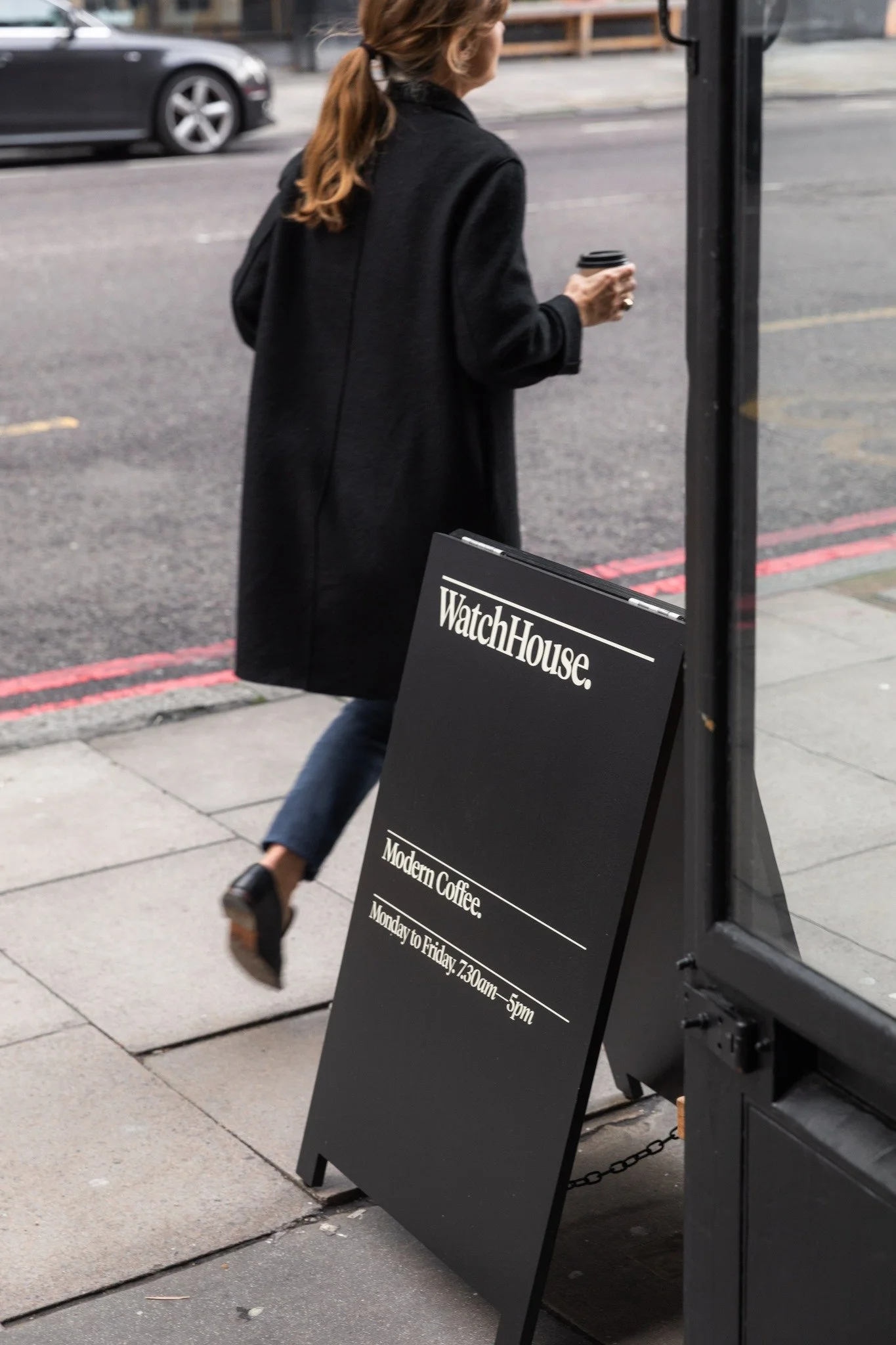
The project started with collating images to create a moodboard for both brands. Focusing on the brand identity, colours, key words and style. The selected images highlight the brand vision and outcome.
WatchHouse | Research + Moodboard
colour combinations
brand identity
saturation

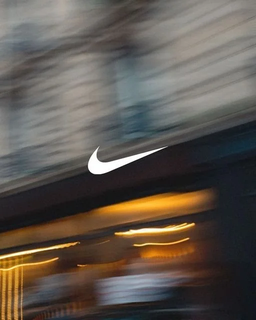

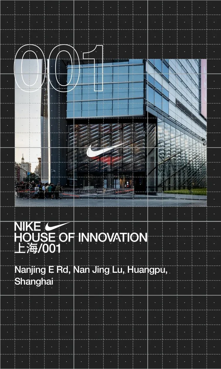
Nike | Research + Moodboard
Next, the same research went into identifying Nike as a brand. The key words help to highlight the train of thought throughout this process.

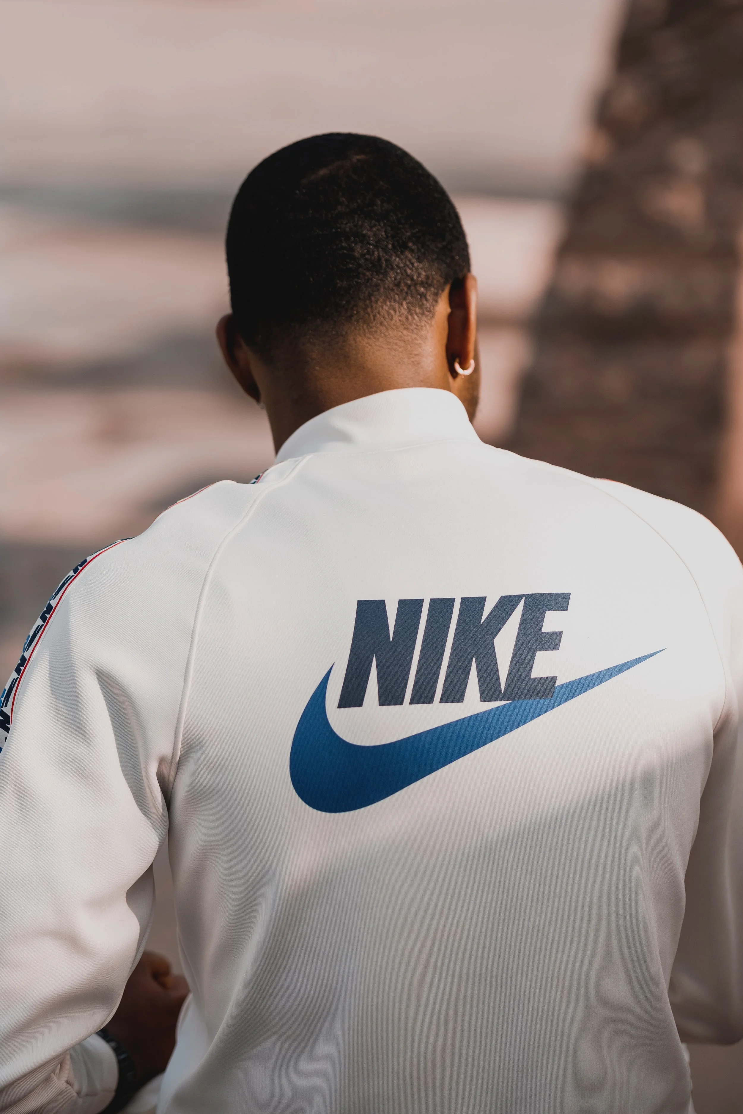

sport
swoosh
composition

trends & collaborations

iconic
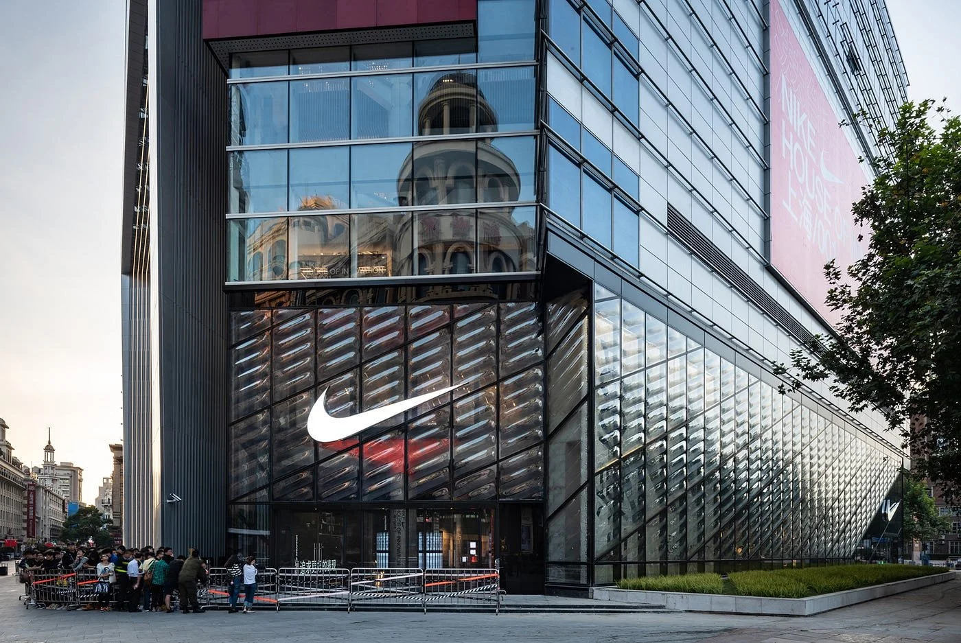
house of innovation


Merging the brands & Building Wireframes
One of the key processes during this project was to merge the two brands in a clear and simple way. I experimented with different ways of using the lettering and logos of both NIKE and WatchHouse to make it feel like one brand.


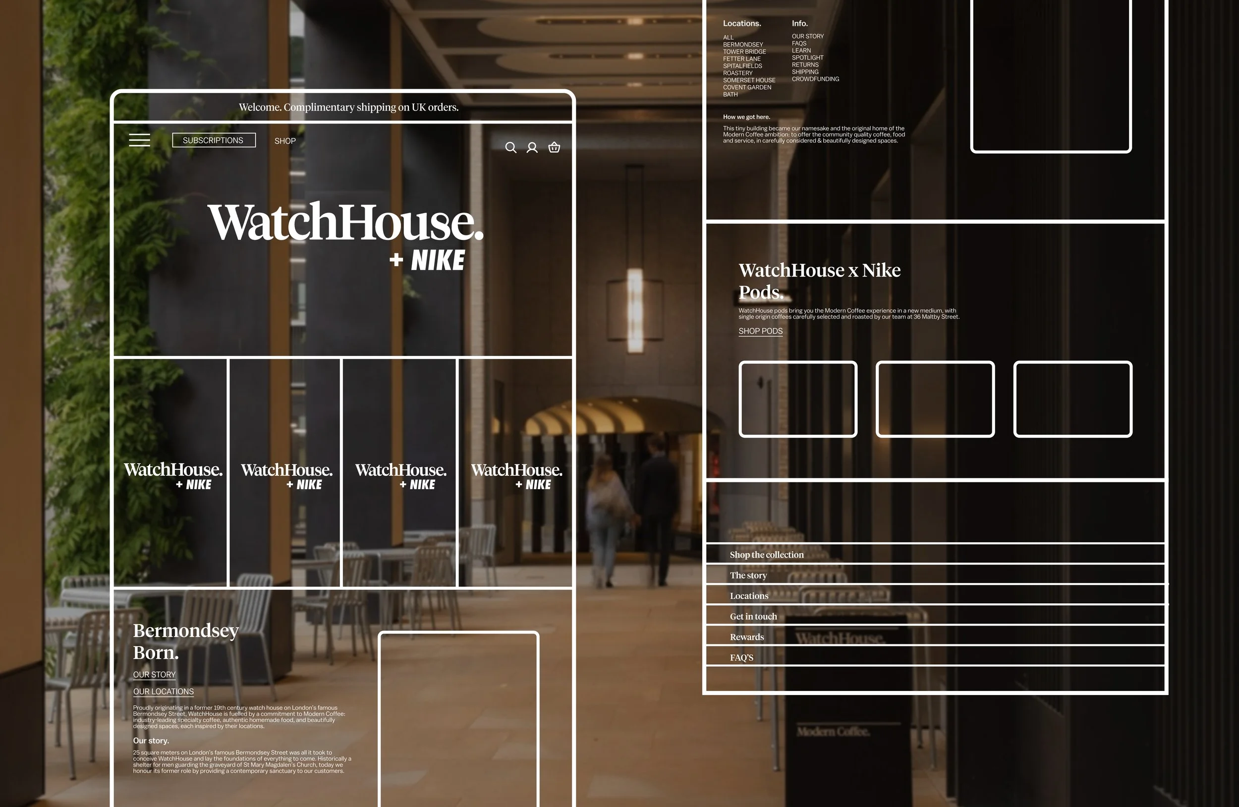


Visual Design & App Prototype
After working on developing the wireframes and user journeys through the app it was time to apply colour palettes and images, whilst maintaining the identity of both brands.
Developing ideas for the app and web page included mapping out ways people are most likely to navigate around both formats with a clear and easy to use experience.


